.webp&w=3840&q=75)
From complex to clarity: Rebranding for business communications
ITC aimed to differentiate itself from competitors by emphasising its commitment to providing complex solutions in a simplified manner. The challenge was to develop a brand identity that encapsulated this value proposition and resonated with the target audience of business decision-makers.

Solution
Show+Tell partnered with ITC to create a brand identity that reflected their position as an industry leader. The core focus was on developing a brand essence, visual language, and tone of voice that would resonate with the target audience and effectively communicate ITC's value proposition.


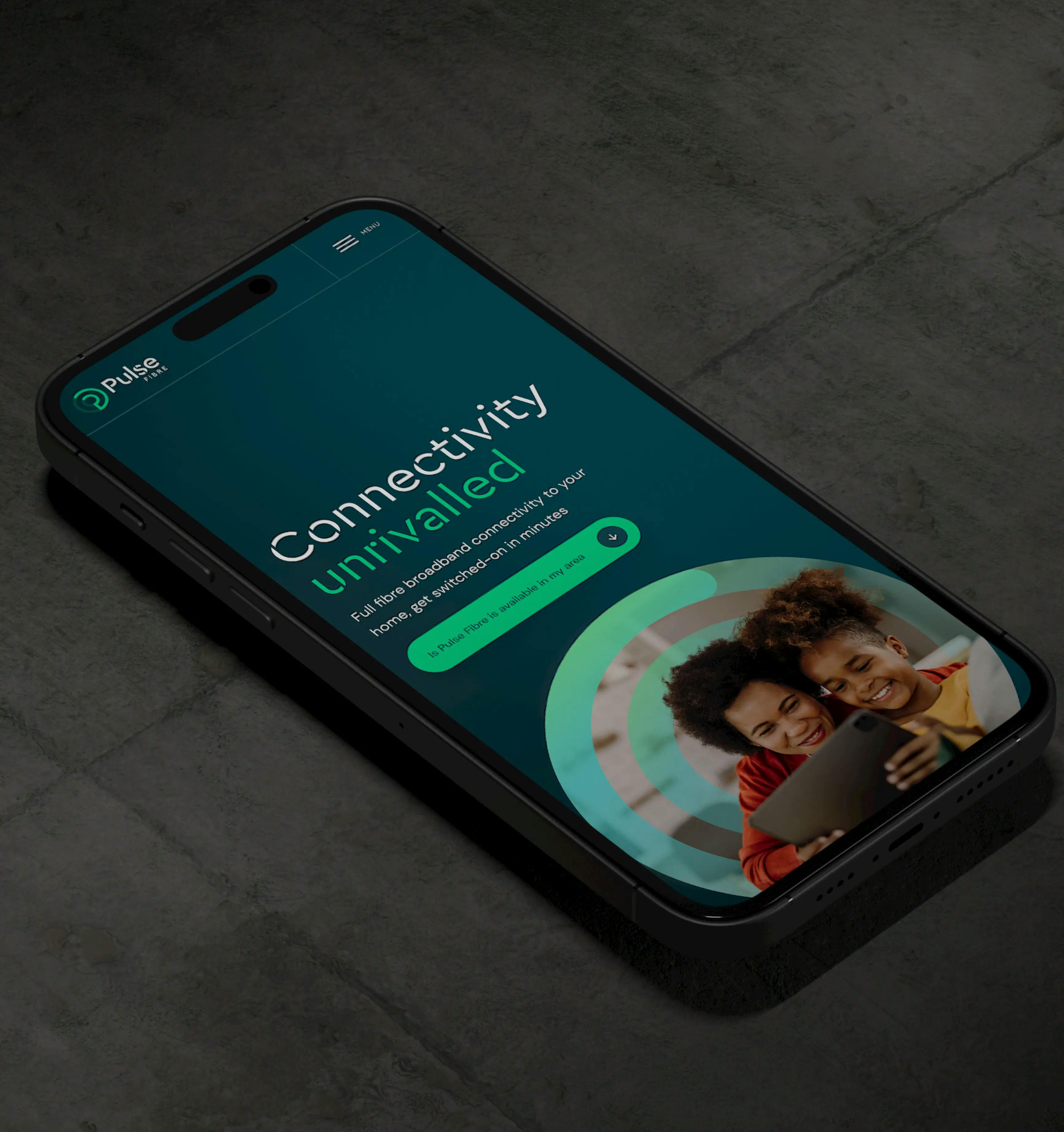
This multi-colour vector wave graphical device stands not only as a symbol but as the cornerstone of a brand's visual identity, seamlessly blending aesthetics with functionality to encapsulate the essence of the industry it represents.
Within the context of B2B telecoms, the Gradient Wave symbolises the dynamic flow of data and information, mirroring the seamless transmission of signals across vast networks. Each undulating crest and trough represents not only the ebb and flow of data but also the interconnectedness of businesses and industries in an increasingly digital landscape, also representing movement, transition and a journey, ultimately symbolising the journey that we are on with our customers.
What we delivered
Uncovering ITC's Brand Essence
Show+Tell embarked on a comprehensive brand development process to transform ITC into a market leader. Our journey began with a deep dive into ITC's core values, mission, and vision through in-depth workshops. A meticulous competitive analysis followed, identifying market gaps and opportunities to position ITC strategically. Understanding the nuances of the target audience was paramount, informing every subsequent stage of the brand development process.
Crafting ITC's Brand Story
Central to the brand development process was the articulation of ITC's brand essence and personality. This involved crafting a compelling brand story that resonated with the target audience and effectively communicated ITC's unique value proposition. The development of a clear and consistent brand voice was essential to ensure that all communications aligned with the brand identity.
Creating a Versatile Brand Identity
A comprehensive exploration of colour palettes, typography, and imagery ensued, guided by the brand's core values and target audience. The development of a versatile and memorable logo was paramount, serving as the visual embodiment of ITC's essence. Careful consideration was given to the logo's application across various platforms and mediums, ensuring its impact and clarity.


The guidelines also included specific guidelines for digital and print applications, ensuring consistency across all channels. By providing a centralised resource for brand assets and usage, the brand guidelines empowered internal teams and external partners to maintain brand integrity and consistency.