Bold Strokes, Bright Results: A Visual Identity Triumph
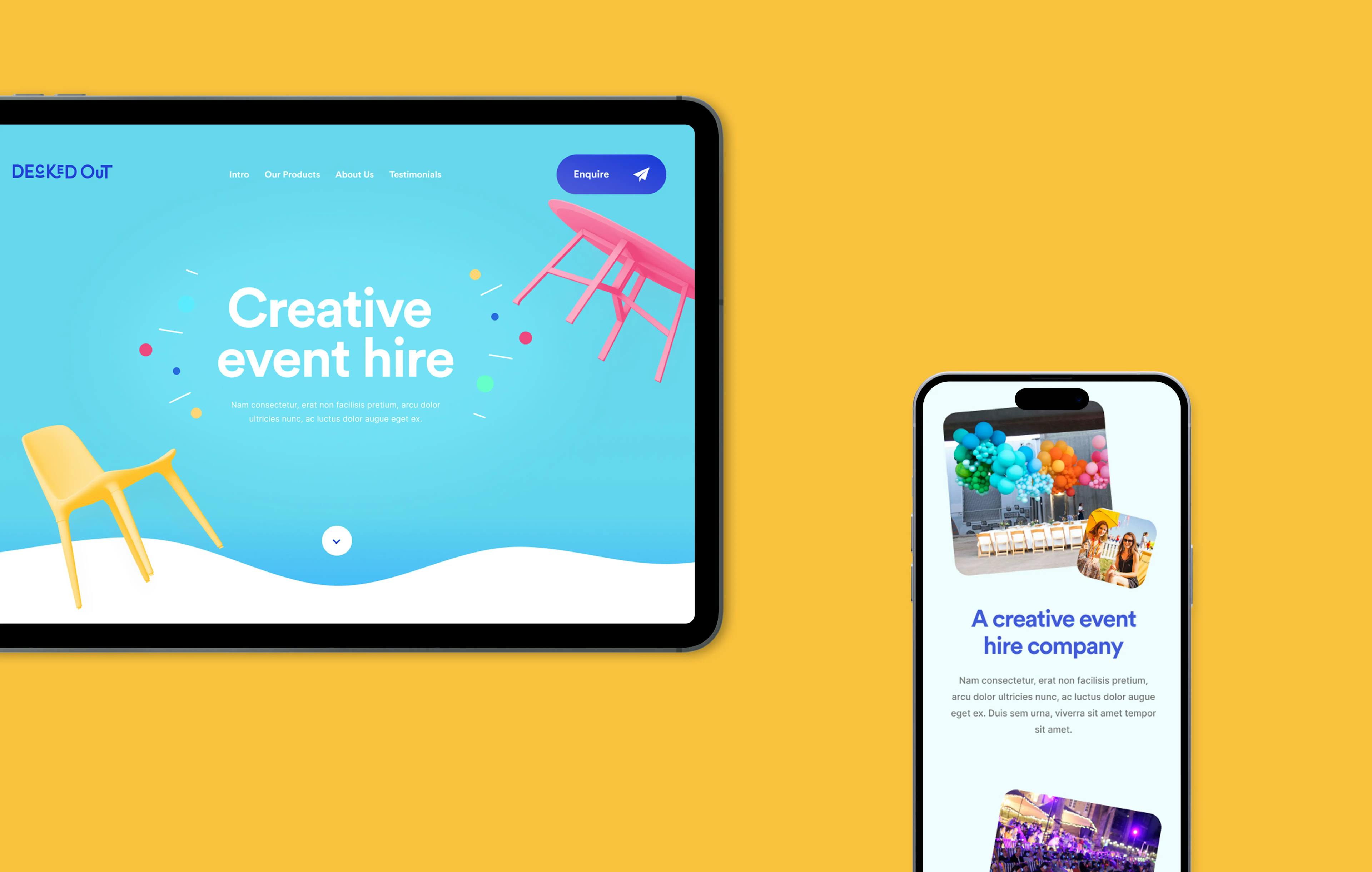
Additionally, they needed a cutting-edge website to generate leads and showcase their wide range of deckchairs. This case study delves into how Show + Tell successfully transformed Decked Out into a fun, quirky, and recognizable brand.
Overview
Show + Tell collaboration with Decked Out resulted in a brand transformation that injected fun, nostalgia, and vitality into the event equipment rental industry. Through a vibrant brand identity and an effective lead-generating website, Decked Out now stands as a prominent player in the market, bringing color, nostalgia, and joy to events of all sizes across the UK. This partnership exemplifies the power of design and digital strategy in redefining a brand's image and impact.


What we delivered
Bringing Whimsy to Branding
We began by collaborating closely with Decked Out's team to gain a deep understanding of their brand values, goals, and target audience. This initial stage was essential for aligning creative direction with Decked Out's vision. The concept was clear: to infuse fun, nostalgia, and vibrant energy into the brand's identity.
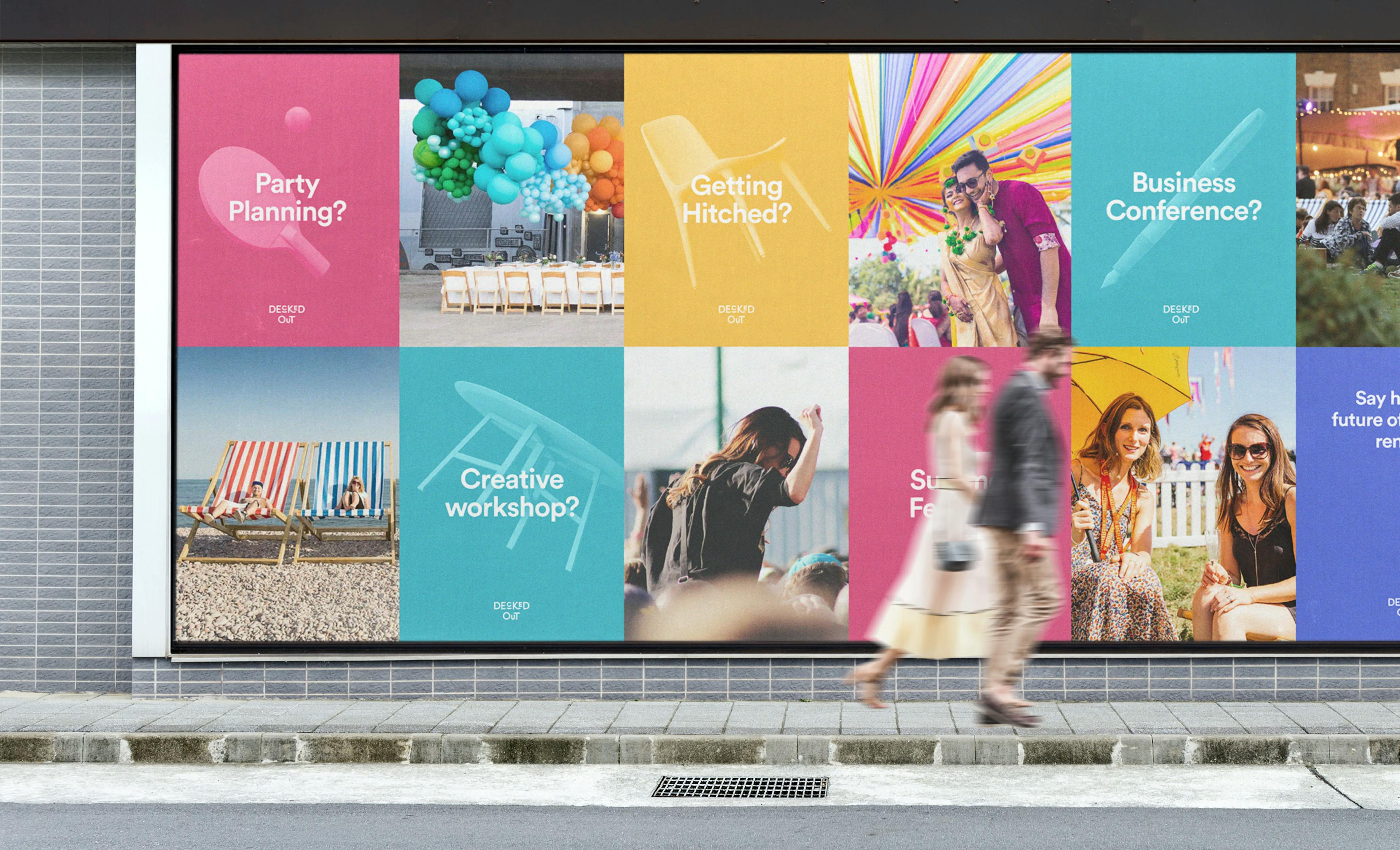
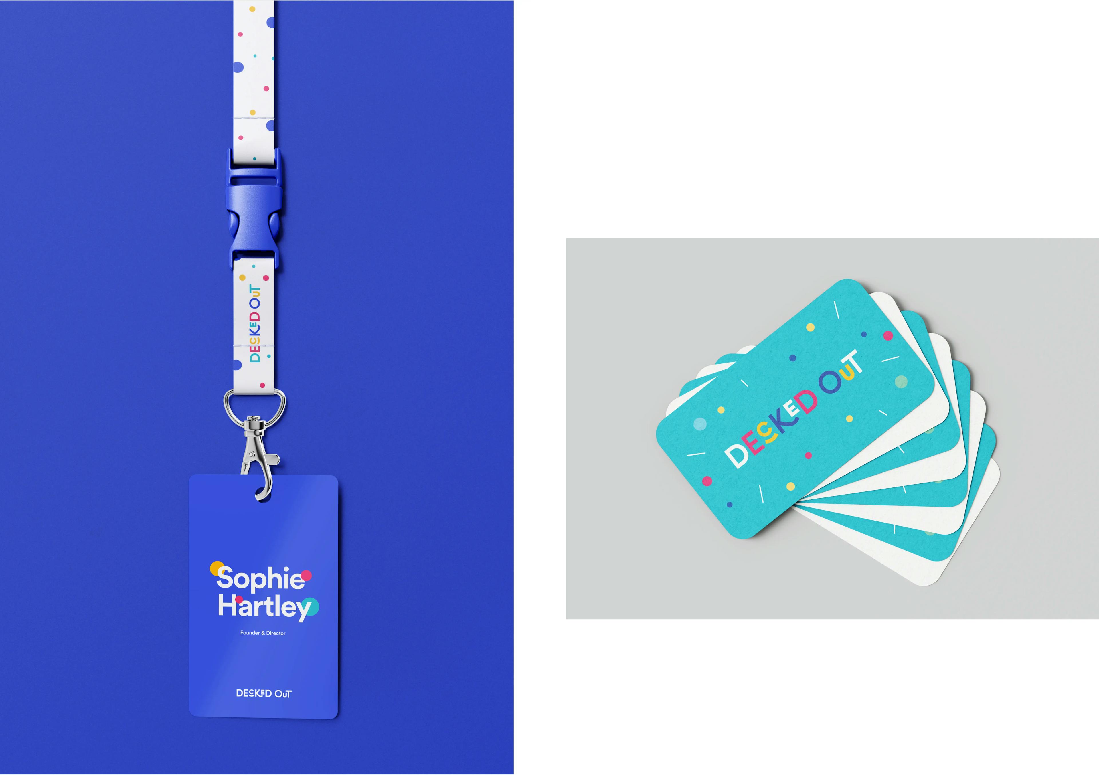
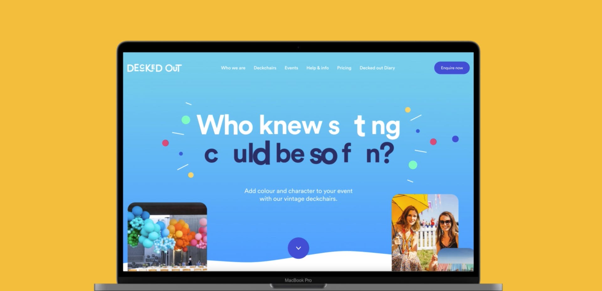
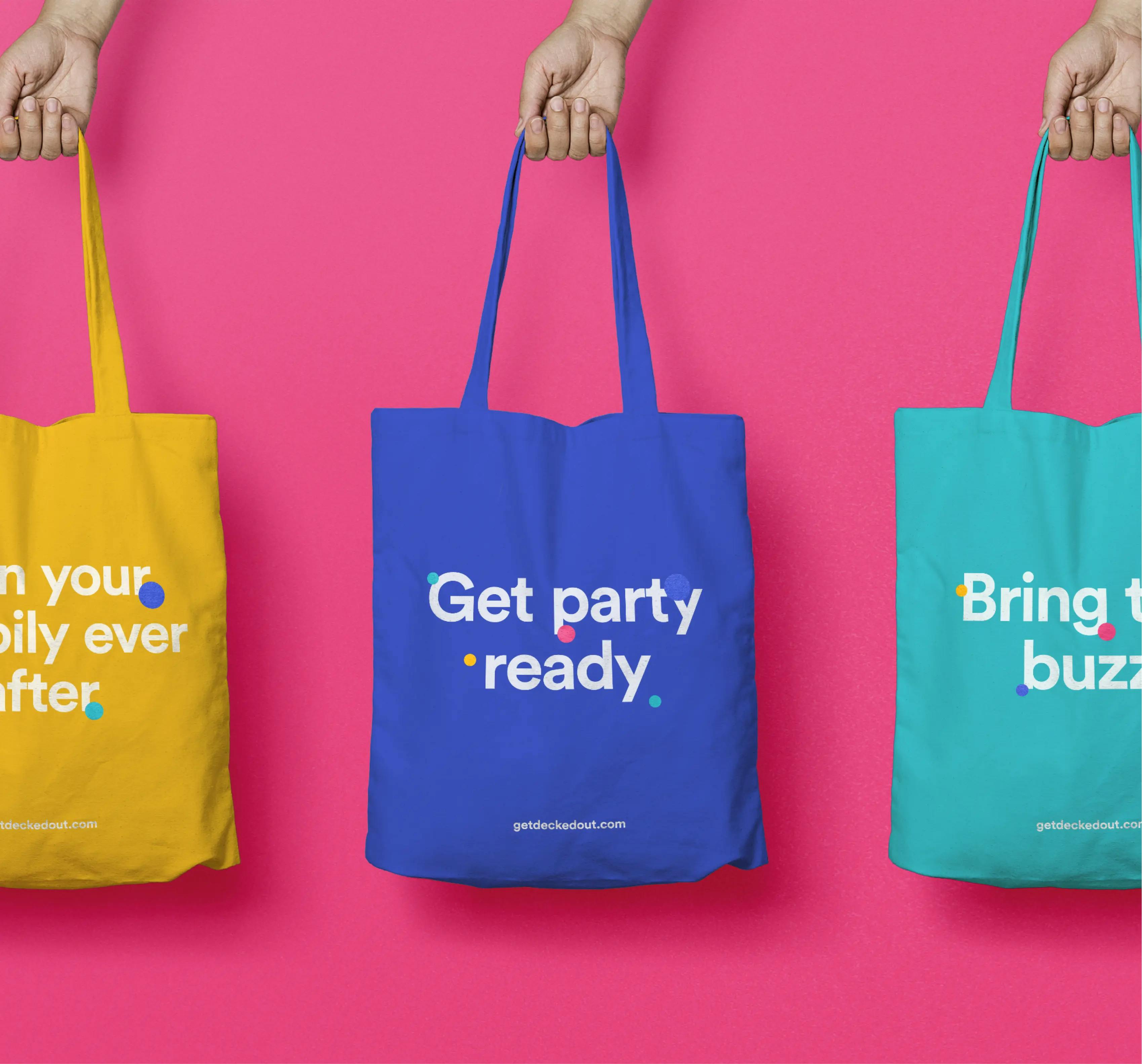
Creative direction steered the incorporation of playful elements throughout the brand's identity and website. This included whimsical illustrations, lively colour palettes, and a dynamic typography choice that exuded a sense of fun and quirkiness. These elements worked cohesively to capture the brand's essence and resonate with its audience.
User-Centric Design: A Seamless Customer Journey
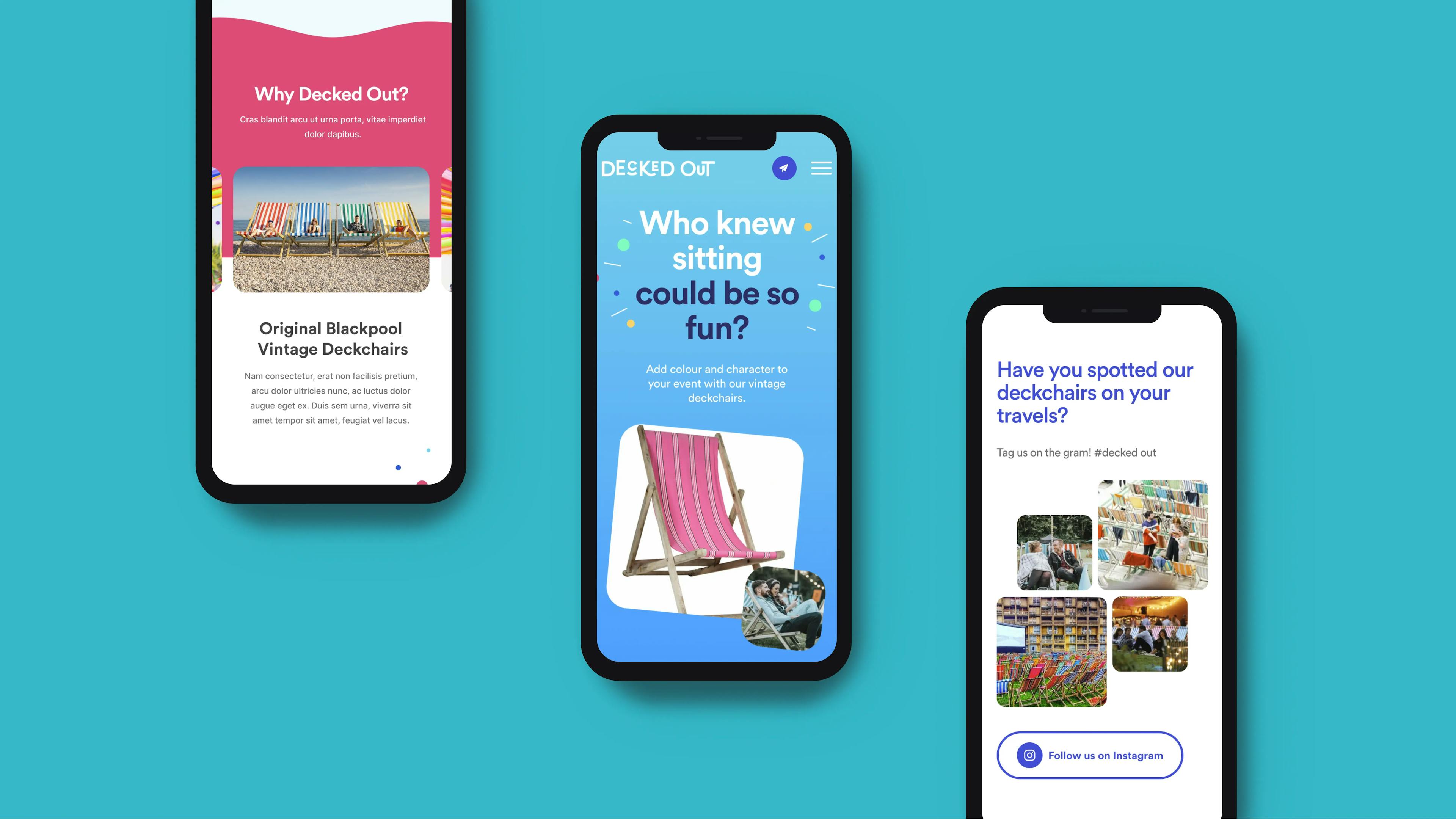
The cornerstone of the website's success lay in creating a user-friendly experience. Show + Tell ensured an intuitive and visually appealing interface that encouraged visitors to explore the deckchair collection and easily inquire about rentals. The user-centric design aimed to streamline the customer journey, making it effortless to navigate and discover the products and services offered.
Capturing Leads: The Heart of Website Strategy
A primary objective of the website was to generate leads. To achieve this, we strategically placed lead generation forms throughout the website. These forms made it convenient for visitors to express their interest, request quotes, or seek additional information. The integration of these forms aimed to capture potential customers' information, ultimately expanding Decked Out's clientele.
