-1.webp&w=3840&q=75)
Going mobile-first for Northern Energy's rural customers
The brief
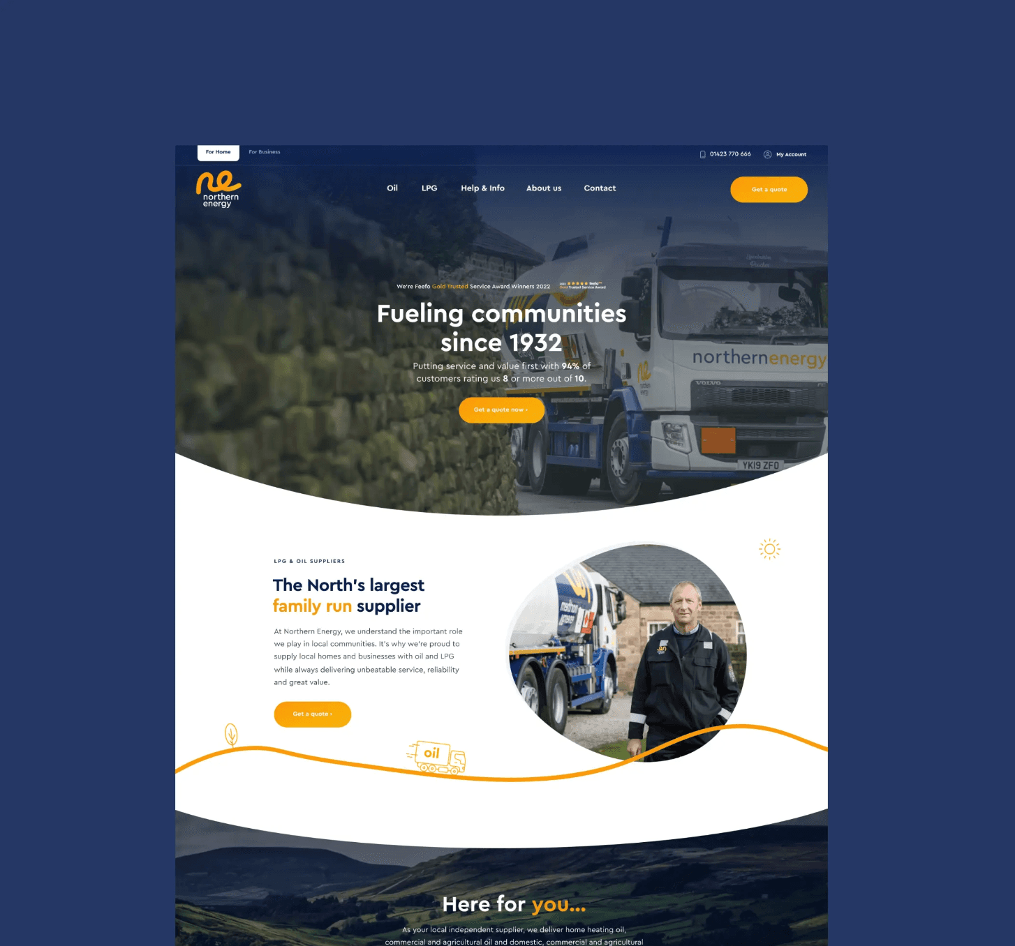
Northern Energy's existing site was built desktop-first, leaving mobile users — often on slow rural connections — with slow load times, high bounce rates and cumbersome conversion journeys. Key tasks like requesting a top-up or viewing tank readings were frustrating on mobile. Show+Tell were tasked with rethinking the entire digital experience with a mobile-first approach, prioritising speed, usability and conversion.
Our approach
We structured the project into clear phases: discovery and research, define and strategy, design and prototyping, user testing, build, and iteration. Stakeholder interviews and analytics audits established performance baselines, while user research with rural customers surfaced key pain points. A mobile-first design strategy was adopted from the outset, paired with a lightweight technical architecture built to support low-bandwidth users.
What we delivered
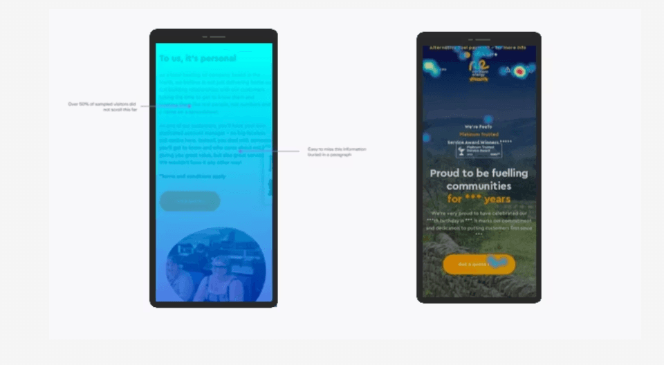
Designed for how customers actually browse
Key actions - Get a Quote, Get a Price, and My Account login - were repositioned to always sit within thumb reach on mobile. We prioritised essential content above the fold and developed a lightweight design system built for performance efficiency. The result is an interface that feels natural and responsive on any device, without compromising on clarity or brand.
Smoother paths to conversion
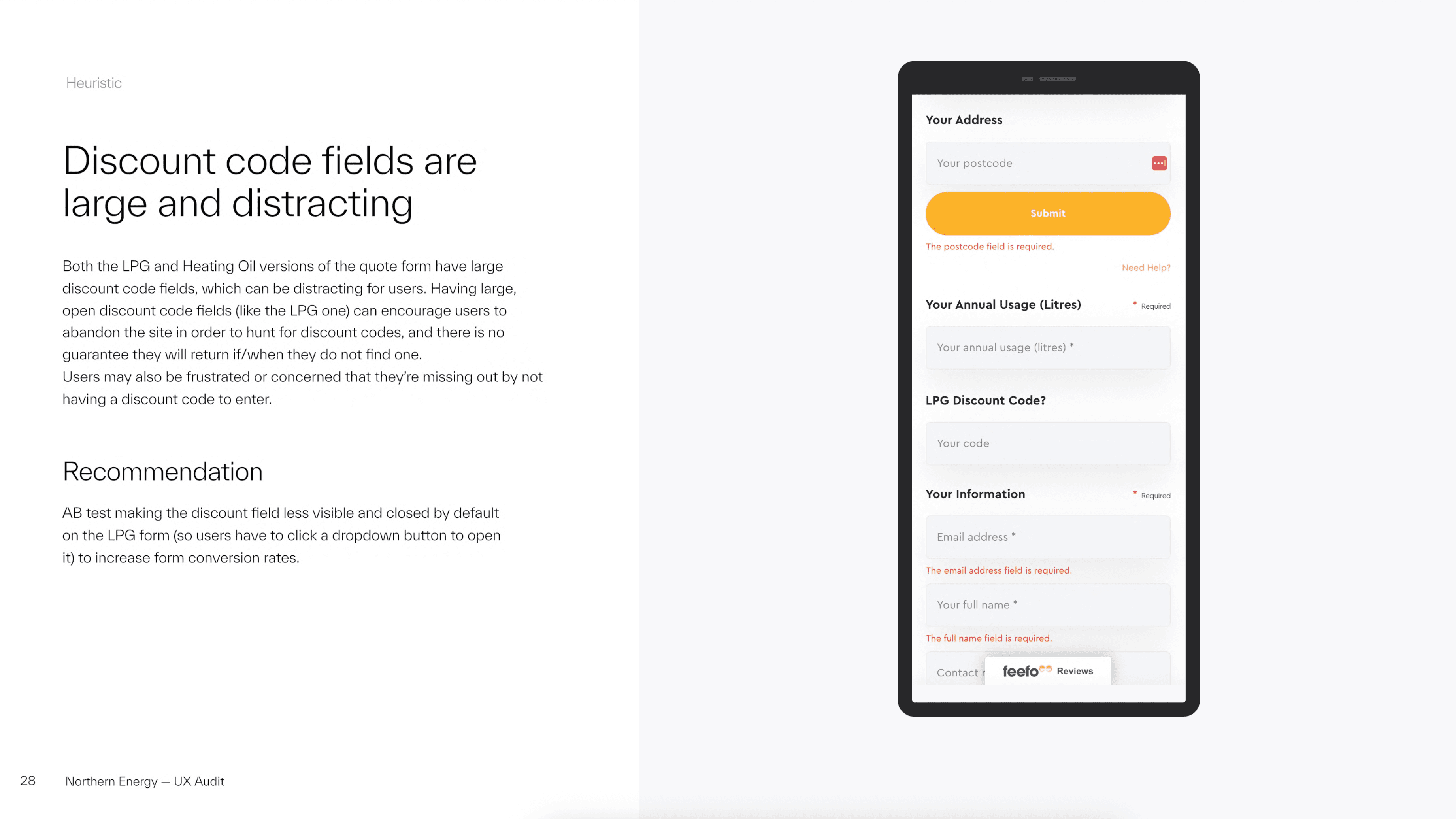
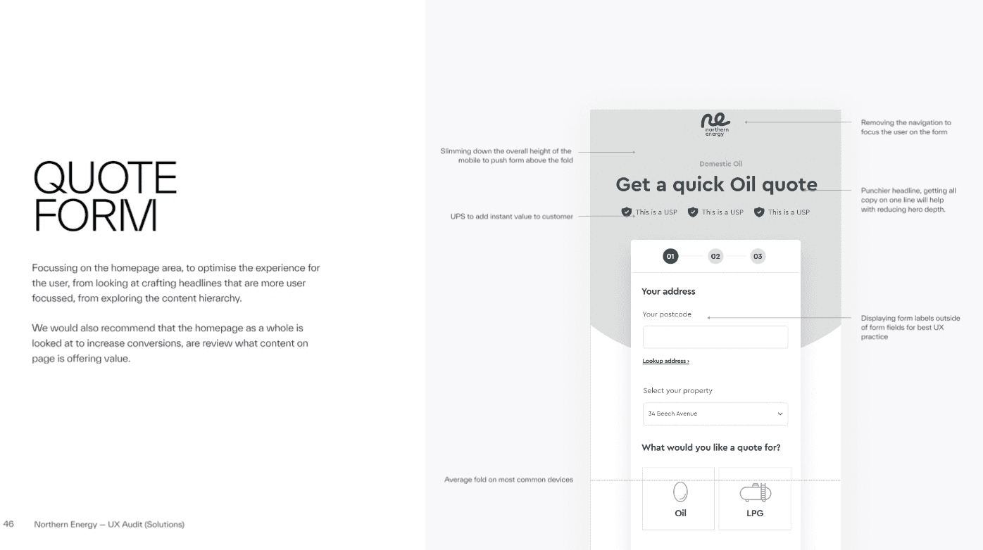
We simplified quote and price forms with mobile-friendly inputs and streamlined the top-up request journey within My Account. User testing with rural customers on real-world 3G and low-signal conditions informed iterative improvements: lighter imagery, shorter form flows and real-time validation all reduced friction and drop-off. The redesigned journeys make it meaningfully easier for customers to complete the tasks that matter most.
Built for rural connectivity
Performance was central to every decision. We implemented lazy-loading, responsive images, asset compression, deferred JavaScript and CDN delivery to reduce server load and ensure fast page loads even on weak connections. Integrated monitoring via PageSpeed and Lighthouse allowed ongoing measurement post-launch.

What we delivered
Discovery and research
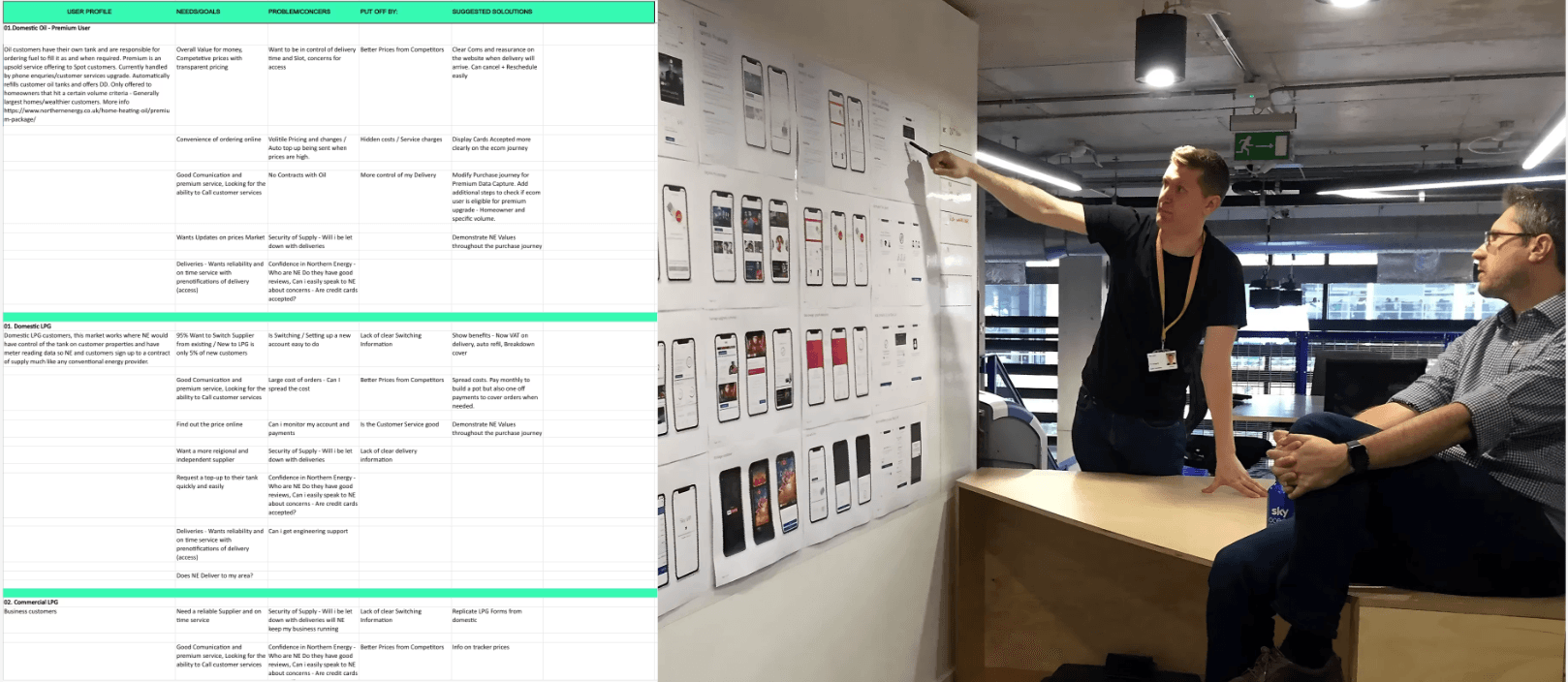
We began with stakeholder interviews to align on business goals and KPIs, followed by in-depth user research with rural customers to identify pain points — from slow-loading pages to abandoned forms. An analytics audit uncovered key drop-off points and established performance baselines. These inputs fed directly into personas and journey maps that shaped every subsequent design and development decision.
Define and strategy
With research complete, we defined the site's architecture through a detailed sitemap and built a component library to underpin a consistent, scalable design system. In parallel, we developed a technical performance strategy covering lightweight CSS and JavaScript, responsive images, caching and CDN usage — ensuring the front-end was engineered for speed from the very start of the design process.
Testing and validation
We recruited rural customers on slower mobile networks to test the key journeys: Get a Quote, Get a Price, and My Account tasks including requesting top-ups and viewing tank readings. Testing was conducted under constrained 3G and low-signal conditions to reflect real-world usage. A/B testing on form designs and task flows generated actionable insights, with findings feeding into a structured iteration plan before launch.
Results
Conversions
Conversion rate
Engagement rate